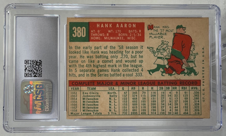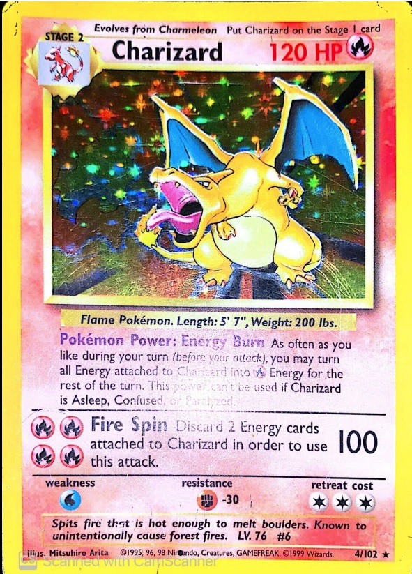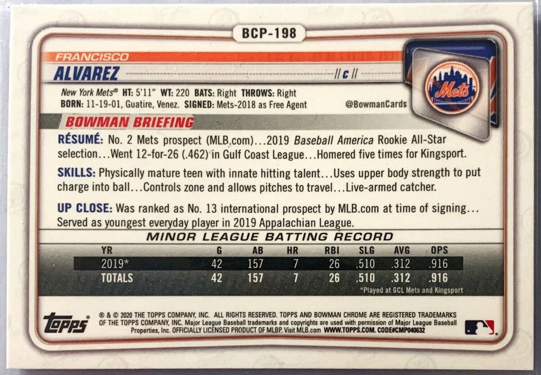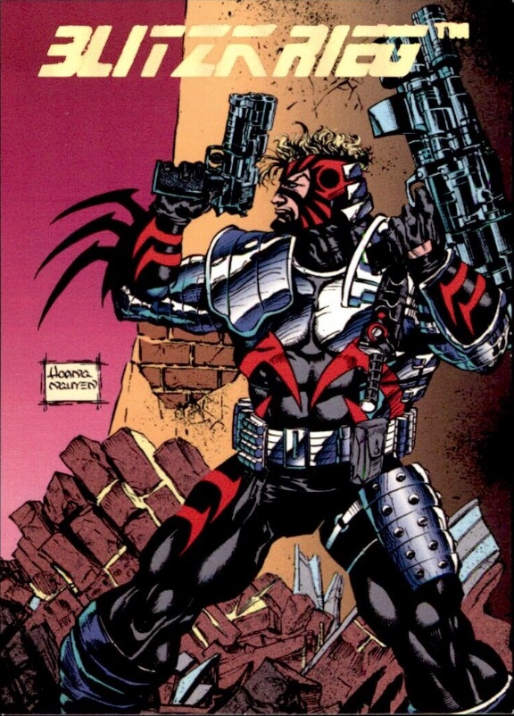
The Reverse
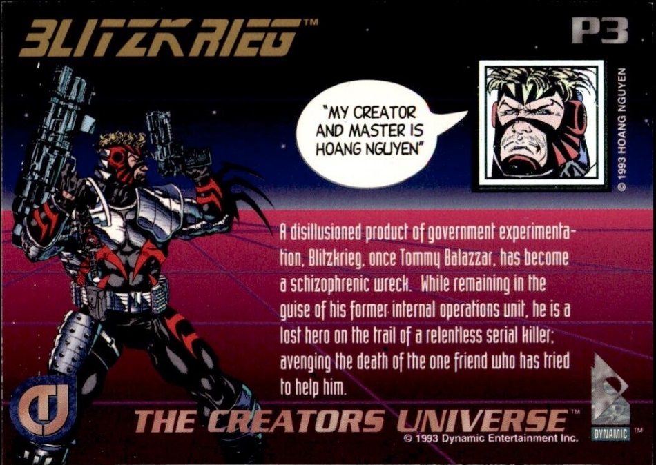
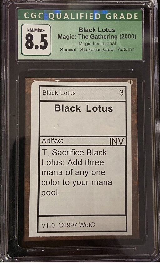
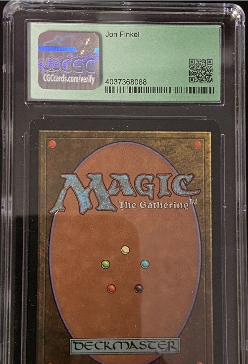
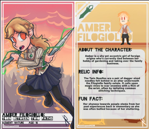
While the front side, or obverse, of our cards are the main focus, the important reason to be, the "why" of why someone would buy a Knowa ATC, the back side (or reverse) is almost as important in the sense that it explains the work and creates desirability. This creation of desirability is vital. Without desirability no sales occur and no market develops. So, it is very important that the reverse creates demand and a BUY signal in the brains of our collectors. With this in mind, we explore the ways reverses have been done in the past, how they are done by billion dollar trading card companies today, and how our reverses can invoke desirability for our art trading cards.
CONSIDERATIONS
TITLE LOCATION — typically the title of the card is located near the top of the reverse, but this isn't etched in stone.
ORIENTATION — (vertical or horizontal) It is not uncommon for the obverse to be vertically-oriented and the reverse horizontal. Horizontal orientation has its advantages, which become obvious as you work with your design.
DESCRIPTION — The description describes the art, either as a curated development of the art itself, or possibly even a poem describing the elements of the art as seen by the poet. It is typically less than 50 words.
RARITY INDICATOR — collectors want to know the size of a limited edition. "EDITION SIZE: 500", for example.
SERIES INDICATOR — collectors want to collect a series. For example, Topps created demand for their sports trading cards by issuing them in annual sets. A set might contain 470 different cards for that year. Each card had its number somewhere on the reverse of the card. Collectors would seek to obtain the complete set. Owning and maintaining a complete set is a prime motivator for collectors and a key to development of a market. A market develops when later collectors attempt to "complete their set."
COLOPHON — A colophon is a brief statement containing information about the card such as place of publication, the publisher, and the date of publication. Our colophon is "(copyright symbol) YEAR Knowa.com Printed in USA.". It should be in 6 point type located somewhere on the back of the card.
COLOR CONSIDERATIONS
BACKGROUND COLOR
FONT COLOR
BORDERS
ELEMENTS
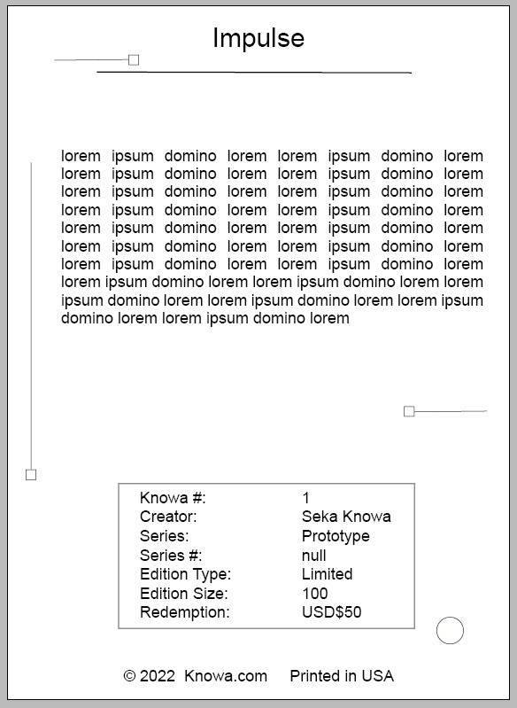
A plain simple black text on white background seems boring. And compared to the work of the big guys, insufficient. On the other hand, art museum and gallery catalogs are known for their stark contrast to the beauty of the actual work of art.
